Android app recommendations

I’ve had my HTC Incredible for about 10 months now, and over that time I have added (and removed) quite a few apps. Here’s a list of the apps that I’m currently using on a regular basis and would recommend to other Android users:

Books & Reference

Communication

Finance

Games

Health & Fitness

Music

News

Photography

Productivity

Shopping

Social

Tools

Travel & Local

View this Android app list on AppBrain

LibFest: Telling your Story with Usage Statistics — Making data work

presenter: Jamene Brooks-Kieffer

She won’t be talking about complex tools or telling you to hire more staff. Rather, she’ll be looking at ways we can use what we have to do it better.

Right now, we have too much data from too many sources, and we don’t have enough time or staff to deal with it. And, nobody cares about it anyway. Instead of feeling blue about this, change your attitude.

Start by looking at smaller chunks. Look at all of the data types and sources, then choose one to focus on. Don’t stress about the rest. How to pick which one? Select data that has been consistently collected over time. If it’s focused on a specific activity, it’ll be easier to create a story about it. And finally, the data should be both interesting and accessible to you.

By selecting only one source of data, you have reduced the stress on time. You also need to acknowledge your limits in order to move forward. You can’t work miracles, but you can show enough impact to get others on board. Tie the data to your organizational goals. Analyze the data using the tools you already have (i.e. Excel), and then publicize the results of your work.

Why use Excel? It’s pretty universal, and there are free alternatives for spreadsheets if you need them. Three useful Excel tools: import & manipulate files of various formats (CSV files), consolidate similar information (total annual data from monthly worksheets), and conditional formatting (identify cost/use over thresholds).

The spreadsheets are for you, not the stakeholders. Stop relying on them to communicate your data. The trouble with spreadsheets is that although they contain a lot of data, it’s challenging for those unfamiliar with the sources to understand the meaning of the data. Sending a summary/story will get your message across faster and more clearly.

Data has context, settings, complexities, and conflicts. One of the best ways of communicating it is through a story. Give stakeholders the context to hang the numbers on and a way to remember why they are important. Write what you know, focus on the important things, and keep it brief and meaningful. Here is an example: Data Stories: A dirty job.

Data stories are everywhere. It’s not strictly for usage or financial data. If you have a specific question you want answered through data, it makes it easier to compose the story.

Convince yourself to act; your actions will persuade others.

presenter: Katy Silberger

She will be showing three scenarios for observing user behavior through statistics: looking at the past with vendor supplied statistics, assessing current user behavior with Google Analytics, and anticipating user behavior with Google Analytics.

They started looking at usage patterns before and after implementing federated searching. It was hard to answer the question of how federated searching changed user behavior. They used vendor usage reports and website visits to calculate the number of articles retrieved per website visit and articles retrieved per search. They found that the federated search tool generated an increase in article/use. The ratios take into account the fluctuation in user populations.

Google Analytics could be used to identify use from students abroad. It’s also helpful for identifying trends in mobile web access.

IL 2010: Dashboards, Data, and Decisions

[I took notes on paper because my netbook power cord was in my checked bag that SFO briefly lost on the way here. This is an edited transfer to electronic.]

presenter: Joseph Baisano

Dashboards pull information together and make it visible in one place. They need to be simple, built on existing data, but expandable.

Baisano is at SUNY Stonybrook, and they opted to go with Microsoft SharePoint 2010 to create their dashboards. The content can be made visible and editable through user permissions. Right now, their data connections include their catalog, proxy server, JCR, ERMS, and web statistics, and they are looking into using the API to pull license information from their ERMS.

In the future, they hope to use APIs from sources that provide them (Google Analytics, their ERMS, etc.) to create mashups and more on-the-fly graphs. They’re also looking at an open source alternative to SharePoint called Pentaho, which already has many of the plugins they want and comes in free and paid support flavors.

presenter: Cindi Trainor

[Trainor had significant technical difficulties with her Mac and the projector, which resulted in only 10 minutes of a slightly muddled presentation, but she had some great ideas for visualizations to share, so here’s as much as I captured of them.]

Graphs often tell us what we already know, so look at it from a different angle to learn something new. Gapminder plots data in three dimensions – comparing two components of each set over time using bubble graphs. Excel can do bubble graphs as well, but with some limitations.

In her example, Trainor showed reference transactions along the x-axis, the gate count along the y-axis, and the size of the circle represented the number of circulation transactions. Each bubble represented a campus library and each graph was for the year’s totals. By doing this, she was able to suss out some interesting trends and quirks to investigate that were hidden in the traditional line graphs.

IL 2010: Beyond 23 Things

presenters: Louise Alcorn, Christa Burns, and Jennifer Koerber

The 23 Things program was designed to introduce library staff to explore and discover new and emerging technologies. Many libraries have taken it and adapted it to their own organizational needs, and some are starting to experiment with doing it with users as well.

Alcorn’s first attempt at doing this was a bit of a failure, in part because her incentives weren’t strong enough, and in part because there wasn’t enough buy-in to self-motivate the participants. Nudging became nagging, which didn’t help.

NWILSA’s 13 Things is done with different instructors online. The participants were given “homework” assignments to keep everything in check. The instructors had dress rehearsals to make sure the tech worked, and it was all through the same Adobe Connect room. The participants were also given a Google Site to keep all the info together, and chat pods to discuss the side conversations that sprouted.

But, there were problems. There needed to be ongoing marketing (not nagging) that promotes each presentation/session. The participants were reluctant to get a headset with a microphone rather than just participating in the text chat. Also, due to staff constraints, they weren’t able to effectively turn the feedback into new programming.

When Nebraska Learns 2.0 ended, many of the participants commented that they were sad to see it end and wanted to do more. So, the organizers looked around to find a way to maintain it as an ongoing project.

However, they noticed that participation and new joiners dropped over time. The problem was, they promoted it initially, but didn’t continue the promotion beyond that until recently. Now, every month, at least one new participant joins and a thing gets done.

Koerber wants to bring the 23 things to the users wherever they are (home, work, library, etc.). The scalability is challenging, particularly for incentives and interaction. It can get a bit unwieldy. The program itself needs to be open-ended and self-driven.

One possible model has WordPress at its core and uses social networks (virtual and physical) to connect the participants. Promotion can be done through bookmarks, flyers, Craigslist, etc. Rather than everyone winning something, participants could be entered into monthly raffles for prizes.

WordCamp Richmond: Exploiting Your Niche – Making Money with Affiliate Marketing

presenter: Robert Sterling

Affiliate marketing is a practice of rewarding an affiliate for directing customers to the brand/seller that then results in a sale.

“If you’re good at something, never do it for free.” If you have a blog that’s interesting and people are coming to you, you’re doing something wrong if you’re not making money off of it.

Shawn Casey came up with a list of hot niches for affiliate marketing, but that’s not how you find what will work for you. Successful niches tend to be what you already have a passion for and where it intersects with affiliate markets. Enthusiasm provokes a positive response. Enthusiasm sells. People who are phoning it in don’t come across the same and won’t develop a loyal following.

Direct traffic, don’t distract from it. Minimize the number of IAB format ads – people don’t see them anymore. Maximize your message in the hot spots – remember the Google heat map. Use forceful anchor text like “click here” to direct users to the affiliate merchant’s site. Clicks on images should move the user towards a sale.

Every third or fourth blog post should be revenue-generating. If you do it with every post, people will assume it’s a splog. Instapundit is a good example of how to do a link post that directs users to relevant content from affiliate merchants. Affiliate datafeeds can be pulled in using several WP plugins. If your IAB format ads aren’t performing from day one, they never will.

Plugins (premium): PopShops works with a number of vendors. phpBay/phpZon works with eBay and Amazon, respectively. They’re not big revenue sources, but okay for side money.

Use magazine themes that let you prioritize revenue-generating content. Always have a left-sidebar and search box, because people are more comfortable with that navigation.

Plugins (free): W3 Total Cache (complicated, buggy, but results in fast sites, which Google loves), Regenerate Thumbnails, Ad-minister, WordPress Mobile, and others mentioned in previous sessions. Note: if you change themes, make sure you go back and check old posts. You want them to look good for the people who find them via search engines.

Forum marketing can be effective. Be a genuine participant, make yourself useful, and link back to your site only occasionally. Make sure you optimize your profile and use the FeedBurner headline animator.

Mashups are where you can find underserved niches (i.e. garden tools used as interior decorations). Use Google’s keyword tools to see if there is a demand and who may be your competition. Check for potential affiliates on several networks (ClickBank, ShareASale, Pepperjam, Commission Junction, and other niche-appropriate networks). Look for low conversion rates, and if the commission rate is less than 20%, don’t bother.

Pay for performance (PPP) advertising is likely to replace traditional retail sales. Don’t get comfortable – it’s easy for people to copy what works well for you, and likewise you can steal from your competition.

Questions:

What’s a good percentage to shoot for? 50% is great, but not many do that. Above 25% is a good payout. Unless the payout is higher, avoid the high conversion rate affiliate programs. Look for steady affiliate marketing campaigns from companies that look like they’re going to be sticking around.

What about Google or Technorati ads? The payouts have gone down. People don’t see them, and they (Google) aren’t transparent enough.

How do you do this not anonymously and maintain integrity in the eyes of your readers? One way to do it is a comparison post. Look at two comparable products, list their features against each other.

WordCamp Richmond: Starting From Scratch – Introduction to Building Custom Themes

presenter: Wren Lanier

Why use WordPress as a CMS for a small website? It’s flexible enough to build all sorts of kinds of sites. It’s free as in beer and there is a huge support community. It has a beautiful admin (particularly compared to other CMS like Drupal) that clients like to use, which means it is more likely to succeed and make them happy repeat clients.

First things first. Set up a local development server (MAMP or XAMPP) or use a web host. This allows you to develop on a desktop machine as if it were a web server.

Next, download dummy content like posts and comments. There are plugins (WP Dummy Content, Demo Data Creator) or imports in XML form.

Start with a blank theme. You could start from scratch, but nobody needs to reinvent the wheel. Really good ones: Starkers (semantic, thorough, and functional), Naked (created for adding your own XHTML), Blank (now with HTML5), and more.

A blank theme will come with several php files for pages/components and a css file. To create a theme, you really only need an index.php, screenshot.png, and style.css files. Lanier begs you to name your theme (i.e. sign your work).

Now that you have a theme name, start with the header and navigation. Next, take advantage of WPs dynamic tags. Don’t use an absolute path to your style sheet, home page, or anywhere else on your site if possible.

Make things even more awesome with some if/then statements. You can do that in PHP. [I should probably dig out my PHP for Dummies reference type books and read up on this.] This allows you to code elements different depending on what type of page you use.

Once you have your header file, build your footer file, making sure to close any tags you have in your header. Code the copyright year to be dynamic.

It doesn’t have to be a blog!

If you’re going to create a static homepage, make sure you name the custom template. If you don’t do this, the WP admin can’t see it. Go into Reading Settings to select the page you created using the homepage template.

Now that you have all that, what goes into the custom template? Well, you have the header and footer already, so now you put THE LOOP in between a div wrapper. The loop is where WP magic happens. It will display the content depending on the template of the page type. It will limit the number of posts shown on a page, include/exclude categories, list posts by author/category/tag, offset posts, order posts, etc.

Once you have your home page, you’ll want to build the interior pages. There are several strategies. You could let page.php power them, but if you have different interior page designs, then you’ll want to create custom page templates for each. But, that can become inefficient, so Lanier recommends using if/then statements for things like custom sidebars. A technique of awesomeness is using dynamic body IDs, which allows you to target content to specific pages using the body_class tag depending on any number of variables. Or, once again you can use an if/then statement. Other options for body classes.

Finish off your theme with the power of plugins. Basics: Akismet, All-In-One SEO, Google XML Sitemaps, Fast Secure Contact Form (or other contact form plugin), WPtouch iPhone theme. For blogs, you’ll want plugins like Author Highlight, Comment Timeout, SEO Slugs (shortens the URL to SEO-friendly), Thank Me Later (first-timer comments will get an email thanking them and links to other content), and WordPress Related Posts. For a CMS, these are good: Custom Excerpts, Search Permalink, Search Unleashed (or Better Search, since the default search is  bit lacking), WP-PageNavi (instead of older/newer it creates page numbering), and WP Super Cache (caches content pages as static HTML and reduces server load).

Questions:

What about multi-user installations? She used Daren Hoyt’s Mimbo theme because it was primarily a magazine site.

At what point do you have too many conditional statements in a template? It’s a balancing act between which is more efficient: conditional statements or lots of PHP files.

How do you keep track of new plugins and the reliability of programmers? Daren Hoyt & Elliot J. Stock are two designers she follows and will check out their recommendations.

What is your opinions of premium themes? For most people, that’s all they need. She would rather spend her time developing niche things that can’t be handled by standard themes.

How do you know when plugins don’t mesh well with each other? Hard to keep up with this as patches are released and updates to WP code.

Where can you find out how to do what you want to do? The codex can be confusing. It’s often easier to find a theme that does the element you are wanting to do, and then figure out how they designed the loop to handle it.

Are parent templates still necessary? Lanier hasn’t really used them.

Leave WP auto-P on or off? She turns them off. Essentially, WP automatically wraps paragraphs with a p tag, which can mess with your theme.

it could be worse

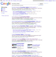
Have you noticed the changes Google has been making to the way they display search results? Google Instant has been the latest, but before that, there was the introduction of the “Everything” sidebar. And that one in particular seems to have upset numerous Google search fans. If you do a search in Google for “everything sidebar,” the first few results are about removing or hiding it.

Not only that, but the latest offering from the Funny Music Project is a song all about hating the Google “Everything” sidebar. The creator, Jesse Smith, expresses a frustration that many of us can identify with, “It’s hard to find a product that does what it does really well. In a world of mediocrity, it’s the exception that excels. Then some jerk has to justify his job by tinkering and jiggering and messing up the whole thing.”

Tech folks like to tinker. We like making things work better, or faster, or be more intuitive. I’ll bet that there are a lot of Google users who didn’t know about the different kinds of content-specific searches that Google offered, or had never used the advanced search tools. And they’re probably happy with the introduction of the “Everything” sidebar.

But there’s another group of folks who are evidently very unhappy with it. Some say it takes up too much room on the screen, that it adds complexity, and that they just don’t like the way it looks.

Cue ironic chuckling from me.

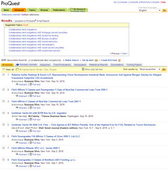
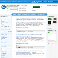
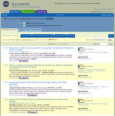
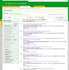
Let’s compare the Google search results screen with search results from a few of the major players in libraryland:

Google

ProQuest EBSCOhost

CSA Illumina ISI Web of Knowledge

So, who’s going to write a song about how much they hate <insert library database platform of choice>?

NASIG 2010: It’s Time to Join Forces: New Approaches and Models that Support Sustainable Scholarship

Presenters: David Fritsch, JSTOR and Rachel Lee, University of California Press

JSTOR has started working with several university press and other small scholarly publishers to develop sustainable options.

UC Press is one of the largest university press in the US (36 journals in the humanities, biological & social sciences), publishing both UC titles and society titles. Their prices range from $97-422 for annual subscriptions, and they are SHERPA Green. One of the challenges they face on their own platform is keeping up with libraries expectations.

ITHAKA is a merger of JSTOR, ITHAKA, Portico, and Alkula, so JSTOR is now a service rather than a separate company. Most everyone here knows what the JSTOR product/service is, and that hasn’t changed much with the merger.

Scholar’s use of information is moving online, and if it’s not online, they’ll use a different resource, even if it’s not as good. And, if things aren’t discoverable by Google, they are often overlooked. More complex content is emerging, including multimedia and user-generated content. Mergers and acquisitions in publishing are consolidating content under a few umbrellas, and this threatens smaller publishers and university presses that can’t keep up with the costs on a smaller scale.

The serials crisis has impacted smaller presses more than larger ones. Despite good relationships with societies, it is difficult to retain popular society publications when larger publishers can offer them more. It’s also harder to offer the deep discounts expected by libraries in consortial arrangements. University presses and small publishers are in danger of becoming the publisher of last resort.

UC Press and JSTOR have had a long relationship, with JSTOR providing long-term archiving that UC Press could not have afforded to maintain on their own. Not all of the titles are included (only 22), but they are the most popular. They’ve also participated in Portico. JSTOR is also partnering with 18 other publishers that are mission-driven rather than profit-driven, with experience at balancing the needs of academia and publishing.

By partnering with JSTOR for their new content, UC Press will be able to take advantage of the expanded digital platform, sales teams, customer service, and seamless access to both archive and current content. There are some risks, including the potential loss of identity, autonomy, and direct communication with libraries. And then there is the bureaucracy of working within a larger company.

The Current Scholarship Program seeks to provide a solution to the problems outlined above that university presses and small scholarly publishers are facing. The shared technology platform, Portico preservation, sustainable business model, and administrative services potentially free up these small publishers to focus on generating high-quality content and furthering their scholarly communication missions.

Libraries will be able to purchase current subscriptions either through their agents or JSTOR (who will not be charging a service fee). However, archive content will be purchased directly from JSTOR. JSTOR will handle all of the licensing, and current JSTOR subscribers will simply have a rider adding title to their existing licenses. For libraries that purchase JSTOR collections through consortia arrangements, it will be possible to add title by title subscriptions without going through the consortia if a consortia agreement doesn’t make sense for purchase decisions. They will be offering both single-title purchases and collections, with the latter being more useful for large libraries, consortia, and those who want current content for titles in their JSTOR collections.

They still don’t know what they will do about post-cancellation access. Big red flag here for potential early adopters, but hopefully this will be sorted out before the program really kicks in.

Benefits for libraries: reasonable pricing, more efficient discovery, single license, and meaningful COUNTER-compliant statistics for the full run of a title. Renewal subscriptions will maintain access to what they have already, and new subscriptions will come with access to the first online year provided by the publisher, which may not be volume one, but certainly as comprehensive as what most publishers offer now.

UC Press plans to start transitioning in January 2011. New orders, claims, etc. will be handled by JSTOR (including print subscriptions), but UC Press will be setting their own prices. Their platform, Caliber, will remain open until June 30, 2011, but after that content will be only on the JSTOR platform. UC Press expects to move to online-only in the next few years, particularly as the number of print subscriptions are dwindling to the point where it is cost-prohibitive to produce the print issues.

There is some interest from the publishers to add monographic content as well, but JSTOR isn’t ready to do that yet. They will need to develop some significant infrastructure in order to handle the order processing of monographs.

Some in the audience are concerned that the cost of developing platform enhancements and other tools, mostly that these costs will be passed on in subscription prices. They will be, to a certain extent, only in that the publishers will be contributing to the developments and they set the prices, but because it is a shared system, the costs will be spread out and likely impact libraries no more than they have already.

One big challenge all will face is unlearning the mindset that JSTOR is only archive content and not current content.

CIL 2010: Productivity Tools

Speaker: Lynda Kellam & Beth Filar-Williams

Check out the presentation wiki for a list of the tools and such. I’ll just note the ones I really like or other commentary I might have. They’ve grouped them into three categories: tasks, notetaking, and scheduling.

The presenters are using Poll Everywhere to get audience input on which category to focus on first, as well as asking for hands for which one. They started with Tasks.

Things is awesome, but Mac/iPhone only. Without a cloud-based interface, it’s not accessible by any other OS. Based on Getting Things Done, the application helps you organize tasks based on contexts.

Todoist is cloud-based task tool. I just started using it myself because I wanted something that could let me add sub-task to tasks.

Remember the Milk is also cloud-based, and like Todoist, it has a mobile interface. Unlike Todoist, it has apps for Blackberry and Android as well as iPhone. Tasks can also be added by SMS. One complaint I had was not being able to see a list of everything due today or overdue in the main web interface (can see it in Gmail), but now I know how to create a saved search that shows overdue tasks (dueBefore:today) and tasks due today (due:today).

The presenters have lots of scheduling tools to share. I’ve heard of only one of them, Schedule Once. The presenters are most excited about jiffle, which pulls your Goolge Calendar availability along with your own selection of available times, and allows the user to request a meeting through the site, but only for the available times. This is really useful for students scheduling personal appointments with instruction librarians. If you’re not using GCal, there is likely a tool that will allow you to sync your calendar with a GCal account.

Cozi integrates calendars, photos, widgets, journals, tasks, and is more geared towards groups or families. It might be more friendly for folks who are not comfortable with disparate, more complicated tools.

They don’t have many notetaking tools listed (Google Docs, Evernote, & wikis). More folks were interested in Evernote. Personally, I just haven’t found a good way to integrate Evernote into my life/work, and I’m not interested in paying for the premium features until I have a reason to use it regularly. I like using the journal feature of Outlook for taking work-related notes, and I rarely need to note things for personal stuff beyond adding them to a task.

CIL 2010: Library Engagement Through Open Data

Speakers: Oleg Kreymer & Dan Lipcan

Library data is meaningless in and of itself – you need to interpret it to give it meaning. Piotr Adamczyk did much of the work for the presentation, but was not able to attend today due to a schedule conflict.

They created the visual dashboard for many reasons, including a desire to expose the large quantities of data they have collected and stored, but in a way that is interesting and explanatory. It’s also a handy PR tool for promoting the library to benefactors, and to administrators who are often not aware of the details of where and how the library is being effective and the trends in the library. Finally, the data can be targeted to the general public in ways that catch their attention.

The dashboard should also address assessment goals within the library. Data visualization allows us to identify and act upon anomalies. Some visualizations are complex, and you should be sensitive to how you present it.

The ILS is a great source of circulation/collections data. Other statistics can come from the data collected by various library departments, often in spreadsheet format. Google Analytics can capture search terms in catalog searches as well as site traffic data. Download/search statistics from eresources vendors can be massaged and turned into data visualizations.

The free tools they used included IMA Dashboard (local software, Drupal Profile) and IBM Many Eyes and Google Charts (cloud software). The IMA Dashboard takes snapshots of data and publishes it. It’s more of a PR tool.

Many Eyes is a hosted collection of data sets with visualization options. One thing I like was that they used Google Analytics to gather the search terms used on the website and presented that as a word cloud. You could probably do the same with the titles of the pages in a page hit report.

Google Chart Tools are visualizations created by Google and others, and uses Google Spreadsheets to store and retrieve the data. The motion charts are great for showing data moving over time.

Lessons learned… Get administrative support. Identify your target audience(s). Identify the stories you want to tell. Be prepared for spending a lot of time manipulating the data (make sure it’s worth the time). Use a shared repository for the data documents. Pull from data your colleagues are already harvesting. Try, try, and try again.

css.php