ER&L 2015 – Link Resolvers and Analytics: Using Analytics Tools to Identify Usage Trends and Access Problems

Google Analytics (3rd ed)

Speaker: Amelia Mowry, Wayne State University

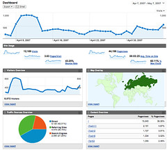
Setting up Google Analytics on a link resolver:

  1. Create a new account in Analytics and put the core URL in for your link resolver, which will give you the tracking ID.
  2. Add the tracking code to the header or footer in the branding portion of the link resolver.

Google Analytics was designed for business. If someone spends a lot of time on a business site it’s good, but not necessarily for library sites. Brief interactions are considered to be bounces, which is bad for business, but longer times spent on a link resolver page could be a sign of confusion or frustration rather than success.

The base URL refers to several different pages the user interacts with. Google Analytics, by default, doesn’t distinguish them. This can hide some important usage and trends.

Using custom reports, you can tease out some specific pieces of information. This is where you can filter down to specific kinds of pages within the link resolver tool.

You can create views that will allow you to see what a set of IP ranges are using, which she used to filter to the use by computers in the library and computers not in the library. IP data is not collected by default, so if you want to do this, set it up at the beginning.

To learn where users were coming from to the link resolver, she created another custom report with parameters that would include the referring URLs. She also created a custom view that included the error parameter “SS_Error”. Some were from LibGuides pages, some were from the catalog, and some were from databases.

Ask specific and relevant questions of your data. Apply filters carefully and logically. Your data is a starting point to improving your service.

Google Analytics (3rd edition) by Ledford, Tyler, and Teixeira (Wiley) is a good resource, though it is business focused.

ER&L 2015 – Understanding Your Users: Using Google Analytics and Forms

Google Analytics v2.0
“Google Analytics v2.0” by Panayotis Vryonis

Speakers: Jaclyn Bedoya & Michael DeMars, CSU Fullerton

There are some challenges to surveying students, including privacy, IRB requirements, and survey fatigue. Don’t collect data for the sake of collecting data. Make sure it is asking what you think it is asking to get results that are worth measuring.

Google Analytics is free, relatively easy to use, and easy to install. And it’s free. We’re being asked to assess, but not being given a budget to do so.

It’s really good about measuring the when and where, but not the why. Is it that you don’t see Chrome users because nobody is using Chrome, or is it that your website is broken for Chrome users?

If people are hanging out on your library pages for too long, then maybe you need to redesign them. We want them heading out quickly to the resources we’re linking to.

They’ve made decisions about whether to spend time on making sites compatible with browser versions based on how much traffic is coming from them. They’ve determined that mobile use is increasing, so they are desigining for that now.

They were able to use click data to eliminate low-used webpages and tools in the redesign. They were able to use traffic data to determine how much server support was needed on the weekends.

Google Forms are free and they can be used to find out things about users that Analytics can’t tell you. They can be embedded into things like LibGuides. There’s a “view summary responses” option that creates pie charts and fancy things for your boss.

They asked who they are (discipline), how often they use the library, where they use it, and what they thought of the library services. There were incentives with gift cards (including ones for In-N-Out Burger). The free-text section had a lot of great content.

The speakers spent some time on the survey data, but the sum total is that it matched their expectations, but now they had data to prove it.

LibFest: Telling your Story with Usage Statistics — Making data work

presenter: Jamene Brooks-Kieffer

She won’t be talking about complex tools or telling you to hire more staff. Rather, she’ll be looking at ways we can use what we have to do it better.

Right now, we have too much data from too many sources, and we don’t have enough time or staff to deal with it. And, nobody cares about it anyway. Instead of feeling blue about this, change your attitude.

Start by looking at smaller chunks. Look at all of the data types and sources, then choose one to focus on. Don’t stress about the rest. How to pick which one? Select data that has been consistently collected over time. If it’s focused on a specific activity, it’ll be easier to create a story about it. And finally, the data should be both interesting and accessible to you.

By selecting only one source of data, you have reduced the stress on time. You also need to acknowledge your limits in order to move forward. You can’t work miracles, but you can show enough impact to get others on board. Tie the data to your organizational goals. Analyze the data using the tools you already have (i.e. Excel), and then publicize the results of your work.

Why use Excel? It’s pretty universal, and there are free alternatives for spreadsheets if you need them. Three useful Excel tools: import & manipulate files of various formats (CSV files), consolidate similar information (total annual data from monthly worksheets), and conditional formatting (identify cost/use over thresholds).

The spreadsheets are for you, not the stakeholders. Stop relying on them to communicate your data. The trouble with spreadsheets is that although they contain a lot of data, it’s challenging for those unfamiliar with the sources to understand the meaning of the data. Sending a summary/story will get your message across faster and more clearly.

Data has context, settings, complexities, and conflicts. One of the best ways of communicating it is through a story. Give stakeholders the context to hang the numbers on and a way to remember why they are important. Write what you know, focus on the important things, and keep it brief and meaningful. Here is an example: Data Stories: A dirty job.

Data stories are everywhere. It’s not strictly for usage or financial data. If you have a specific question you want answered through data, it makes it easier to compose the story.

Convince yourself to act; your actions will persuade others.

presenter: Katy Silberger

She will be showing three scenarios for observing user behavior through statistics: looking at the past with vendor supplied statistics, assessing current user behavior with Google Analytics, and anticipating user behavior with Google Analytics.

They started looking at usage patterns before and after implementing federated searching. It was hard to answer the question of how federated searching changed user behavior. They used vendor usage reports and website visits to calculate the number of articles retrieved per website visit and articles retrieved per search. They found that the federated search tool generated an increase in article/use. The ratios take into account the fluctuation in user populations.

Google Analytics could be used to identify use from students abroad. It’s also helpful for identifying trends in mobile web access.

CIL 2010: Library Engagement Through Open Data

Speakers: Oleg Kreymer & Dan Lipcan

Library data is meaningless in and of itself – you need to interpret it to give it meaning. Piotr Adamczyk did much of the work for the presentation, but was not able to attend today due to a schedule conflict.

They created the visual dashboard for many reasons, including a desire to expose the large quantities of data they have collected and stored, but in a way that is interesting and explanatory. It’s also a handy PR tool for promoting the library to benefactors, and to administrators who are often not aware of the details of where and how the library is being effective and the trends in the library. Finally, the data can be targeted to the general public in ways that catch their attention.

The dashboard should also address assessment goals within the library. Data visualization allows us to identify and act upon anomalies. Some visualizations are complex, and you should be sensitive to how you present it.

The ILS is a great source of circulation/collections data. Other statistics can come from the data collected by various library departments, often in spreadsheet format. Google Analytics can capture search terms in catalog searches as well as site traffic data. Download/search statistics from eresources vendors can be massaged and turned into data visualizations.

The free tools they used included IMA Dashboard (local software, Drupal Profile) and IBM Many Eyes and Google Charts (cloud software). The IMA Dashboard takes snapshots of data and publishes it. It’s more of a PR tool.

Many Eyes is a hosted collection of data sets with visualization options. One thing I like was that they used Google Analytics to gather the search terms used on the website and presented that as a word cloud. You could probably do the same with the titles of the pages in a page hit report.

Google Chart Tools are visualizations created by Google and others, and uses Google Spreadsheets to store and retrieve the data. The motion charts are great for showing data moving over time.

Lessons learned… Get administrative support. Identify your target audience(s). Identify the stories you want to tell. Be prepared for spending a lot of time manipulating the data (make sure it’s worth the time). Use a shared repository for the data documents. Pull from data your colleagues are already harvesting. Try, try, and try again.

css.php