Ebooks aren’t terrible. Instead, we’d like to think of them as teenagers. They’re always changing, often hard to find, and difficult to interact with. Lots of terrible teenagers turn into excellent human beings. There is hope for ebooks.
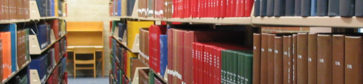
Scholar’s Portal is a repository for purchased ebooks. Used to be mostly DRM-free, but in 2013, they purchased books from two sources that came with DRM and other restrictions. One of those sources were from Canadian UPs, and they really needed to be viable for course adoption (read: sell many copies to students instead of one to the library). The organization wanted everything, so they agreed to the terms.
In adding this content, with very different usability, they had to determine how they were going to manage it: loan periods, Adobe Digital Editions, and really, how much did they want to have to explain to the users?
One of the challenges is not having control over the ADE layout and wording for alerts and error messages. You can’t use a public computer easily, since your user ID can be logged in on six devices at most.
Faculty can’t use the books in their class. Communicating this to them is… difficult.
Ecclestone did a small usability test. Tried to test both a user’s ability to access a title and their perception of borrowable ebooks. The failure rate was 100%.
Lessons learned: Adobe = PDFs (they don’t get that ADE is not the same); .exe files are new to students, or potentially viruses; returning ebooks manually is never going to happen; and terms like “borrow” and “loan” are equated with paying.
The paradox is that it’s really challenging the first time around, but once they have the right software and have gone through the download process, it’s easier and they have a better opinion.
Suggestions for getting ready to deal with DRM ebooks: Train the trainer. Test your interface.
They put error messages in LibAnswers and provide solutions that way in case the user is searching for help with the error.
Asked some folks on Twitter why their library has a website. A few of the responses: to link to online resources, to allow access to the catalog, to support research needs, to provide access to resources & services, to teach, to help, to provide access to account function, to post events, to post policies & hours, it’s the primary way our patrons interact with us, and as a two-way communication tool between the library and the community they serve. Audience member noted that marketing your library is missing.
While we are all unique little snowflakes, we aren’t all that unique in our motivations for having a library website. So, how can we learn from each other?
Website planning needs to have a clear understanding of scope. Since most of us have a website, this talk will focus more on redesign than from building from scratch. Most people tend to skip the scoping step when doing a redesign because we assume that it will cover the same stuff we already have.
Sadly, most libraries are like a big, messy junk drawer of stuff. We tend to take a “just in case” approach to designing sites. Less is not more, less is actually less, and that’s a good thing. Consider the signal to noise ratio of your website. What users don’t need is too much noise drowning out the signal. Pay attention to how much you are putting on the site that meets your needs rather than your user’s needs. It’s better for half of your website to be amazing than all of it to be bland.
Think about your website like a pyramid, where the bottom half is the basics, followed by destination information, then participatory components, and finally a community portal. Think of it like Maslow’s hierarchy of needs — the basic stuff has to be good or you can’t get to the participatory level.
Etches and some colleagues created a website experiment that is an entire library site on one page called the One-Pager. Freehold Public Library has taken this and ran with it, if you want to see it working in the real world.
Designing for mobility requires you to pare back to what you consider to be essential functionality, and a great way to help scope your website. If you wouldn’t put it on your mobile version, think about why you should put it on your desktop website. Recommend the book Mobile First as an inspiration for scope.
How do you determine critical tasks of a website? As your users. A simple one-page survey, interviews, focus groups, and heat maps. Asking staff is the least useful way to do it.
Web users don’t read content, they skim/scan it. People don’t want to read your website; they want to find information on it. When writing copy for your website, pare it down, and then pare it down again. Your website should be your FAQ, not your junk drawer. Think about your website as bite-sized chunks of information, not documentation. Adopt the inverted pyramid style for writing copy. If you have a lot of text, bold key concepts to catch skimming eyes. Eye-catching headers work well in conjunction with the inverted pyramid and bolded key concepts.
Treat your website like a conversation between you and your users/audience. Pages not be written by passive voiced writers. Write in the active voice, all of the time, every time. Library = we; User = you
It is not easy to redo the navigation on a website. Bad navigation makes you think, good navigation is virtually invisible. Navigation needs to serve the purposes of telling the user: site name, page name, where they are, whey they can go, and how they can search. Salt Lake City Public Library and Vancouver Public Library do this very well, if you want some real-world examples.
It’s very important to match navigation labels to page names. Also keep in mind that your navigation is not your org chart, so don’t design navigation along that. Do not, ever (and I’m surprised we still have to talk about this 15 years after I learned it), use “click here”. Links should be descriptive.
Why test websites at all? A lack of information is at the root of all bad design decisions. Usability testing runs the gamut from short & easy to long & hard. Watch people use your site. It can take just five minutes to do that.
We are not our patrons, so don’t test librarians and library staff. They are also not your primary user group and not the ones you need to worry about the most. Five testers are usually enough for any given test, more than that and you’ll get repetition. No test is too small; don’t test more than three things at once. Make iterative changes as you go along. Test early and often. The best websites do iterative changes over time based on constant testing.
Have a script when you are testing. You want to ensure that all testers receive the same instructions and makes it a little more comfortable for the test giver. Provide testers with an outline of what they will be doing, and also give them a paper list of tasks they will be doing. Remind them that they aren’t the ones being tested, the website is. Don’t tell them where to go and what to do (i.e. “search a library database for an article on x topic”).
From Q&A section:
All of your navigation items should be in one place and consistent across the site.
What do you do when use and usability says that you should remove a page a librarian is keen to keep? One suggestion is to put it in a LibGuide. Then LibGuides become the junk drawer. One way to keep that from happening is to standardizing the look and feel of LibGuides.
For policies, you could put a summary on the website and then link to the full document.
Speakers: Lynn Fields & Chris Bulock, Southern Illinois University Edwardsville
They have a link resolver, database list, and A-Z journal list. They formed a task force a few years ago to redo the webpage. They decided to approach it from a UX perspective, rather than library committee perspective.
Their initial survey of users found what most of us have learned about our websites: too many links, too much text, too much library jargon. They implemented many changes based on this, and then then did some observational study of users doing two specific tasks. This also resulted in identifying confusing aspects of the library site, so they made more changes and did another observational study. For that one, they divided the participants into two groups in order to determine which aspect of the modifications was more effective.
They took what they learned from the website studies and applied that to a study of the catalog use. They wanted to know if users could find an ebook in the catalog (distinguishing it from a print book), understand the catalog displays (and use faceting), and understand the consortia catalog interface.
Lessons learned:
There’s a gap between freshman and senior instruction. They need to develop more instruction sessions on specific topics like ebooks and facets.
Discovery is more than the journey from search box to full text, and there are many factors that impact the end result. This includes the look of a database/catalog, names and labels for resources, placement of the search box, etc.
Core lessons:
1. names and language
Would students know how to define a database, periodical, e-resource, or even research? Using action-based language is more effective. Cutting down on vendor branding helps, too.
2. order matters
First impressions are important, so arrange the order of things by importance/relevance. Minimize reading. Descriptions or lengthy cues are often ignored.
3. be familiar
If you do a search in Google, Amazon, or WorldCat, you get very similar looking search results pages. If you put important content on the right column of your search results page, it won’t be as visible because users are used to ignoring advertising on that part of the screen.
4. let the users help you
Surveys, focus groups, observation studies… and get more than just the vocal minority. Observational studies are more about what they actually do than what they say they do, and are much more valuable in that way. Capture data about errors by making it easy for users to contact you (i.e. EZproxy host errors).
5. search boxes
No box can search everything, but people will use it for anything. If the search box is limited, make that clear. Searches of database titles (not content) can be problematic, as users expect it to search for article-level content.
6. work together
Discovery doesn’t respect department divisions. Work together from the beginning.
Don’t think that doing this once is enough. Keep it ongoing, and remember that the discovery process has many steps.
tl;dr — Usability studies and improving the user experience is hard, but necessary. Discovery isn’t just about buying some massive central index of content.
What does print holdings mean to you? If you said “the books/journals in paper on a shelf in the library,” then you’re probably a librarian. Our students don’t know what it means — most of them think it has something to do with printing something from a computer. And yet, that’s what we have had our print holdings labeled as in our “journal locator” (aka A-Z list and link resolver) for years. Until two weeks ago, when I changed it.
It never occurred to me that “print holdings” would be confusing to someone, since it’s pretty clear to me what it means. But I don’t think like an undergraduate student anymore, much less an undergraduate student in 2011. It wasn’t until I had spent so much time looking at our print journal holdings that it dawned on me that this language may not be very clear to our modern students.
My main project this summer involved taking information from an inventory of our print journal collection and adding the coverage dates to the entries in our A-Z/linking list. In addition, I added notes about the location (we have journals in four main locations, with a few in the book stacks and the archives) and any anomalies. Now when someone looks up a title, it will say “University of Richmond Libraries” followed by the location (i.e. “Boatwright Periodicals – Second Floor”).
I’d love to change the name “periodicals” to something else, but I’m not sure what. Also, it’s the location name in our catalog, and I’m trying to be consistent. At least it’s not “print holdings” anymore.
The next phase in my efforts to make our A-Z/linking list more useful to the novice was to add icons for peer-reviewed titles (example). I’m using the code that Karen Coombs developed a couple of years ago. Took me until now to realize that it’s not that complicated to implement, particularly once I realized that we’re using JQuery on our website already, so getting it set up and maintained is not my responsibility.
Next, I’m hoping to add links to RSS feeds where available, but I can only find references to the code for that. I’ll keep digging, but it’s dropping lower on the priority list.
He’s a librarian that fell in love with the web and moved into working with information architecture. When he first wrote the book Information Architecture, he and his co-author didn’t include a definition of information architecture. With the second edition, they had four definitions: the structural design of shared information environments; the combination of organization, labeling, search, and navigation systems in webs sites and intranet; the art and science of shaping information products and experiences to support usability and finadability; an emerging discipline and community of practice focused on bringing principles of designing and architecture to the digital landscape.
[at this point, my computer crashed, losing all the lovely notes I had taken so far]
Information systems need to use a combination of categories (paying attention to audience and taxonomy), in-text linking, and alphabetical indexes in order to make information findable. We need to start thinking about the information systems of the future. If we examine the trends through findability, we might have a different perspective. What are all the different ways someone might find ____? How do we describe it to make it more findable?
We are drowning in information. We are suffering from information anxiety. Nobel Laureate Economist Herbert Simon said, “A wealth of information creates a poverty of attention.”
Ambient devices are alternate interfaces that bring information to our attention, and Moreville thinks this is a direction that our information systems are moving towards. What can we now do when our devices know where we are? Now that we can do it, how do we want to use it, and in what contexts?
What are our high-value objects, and is it important to make them more findable? RFID can be used to track important but easily hidden physical items, such as wheelchairs in a hospital. What else can we do with it besides inventory books?
In a world where for every object there are thousands of similar objects, how do we describe the uniqueness of each one? Who’s going to do it? Not Microsoft, and not Donald Rumsfeld and his unknown unknown. It’s librarians, of course. Nowadays, metadata is everywhere, turning everyone who creates it into librarians and information architects of sorts.
One of the challenges we have is determine what aspects of our information systems can evolve quickly and what aspects need more time.
In five to ten years from now, we’ll still be starting by entering a keyword or two into a box and hitting “go.” This model is ubiquitous and it works because it acknowledges human psychology of just wanting to get started. Search is not just about the software. It’s a complex, adaptive system that requires us to understand our users so that they not only get started, but also know how to take the next step once they get there.
Some example of best and worse practices for search are on his Flickr. Some user-suggested improvements to search are auto-compete search terms, suggested links or best bets, and for libraries, federated search helps users know where to begin. Faceted navigation goes hand in hand with federated search, which allows users to formulate what in the past would have been very sophisticated Boolean queries. It also helps them to understand the information space they are in by presenting a visual representation of the subset of information.
Morville referenced last year’s presentation by Mike Kuniavsky regarding ubiquitous computing, and he hoped that his presentation has complemented what Kuniavsky had to say.
Libraries are more than just warehouses of materials — they are cathedrals of information that inspire us.
Speakers: Daniel Wendling & Neal K. Kaske, University of Maryland
How should we describe information-seeking behavior?
A little over a third of the students interviewed reported that they use Google in their last course-related search, and it’s about the same across all classes and academic areas. A little over half of the same students surveyed used ResearchPort (federated search – MetaLib), with a similar spread between classes and academic areas, although social sciences clearly use it more than the other areas. (survey tool: PonderMatic – copy of survey form in the conference book).
Their methodology was a combination of focus-group interviews and individual interviews, conducted away from the library to avoid bias. They used a coding sheet to standardize the responses for input into a database.
This survey gathering & analysis tool is pretty cool – I’m beginning to suspect that the presentation is more about it than about the results, which are also rather interesting.
Speaker: Ken Varnum
Will students use social bookmarking on a library website?
MTagger is a library-based tagging tool, borrowing concepts from resources like Delicious or social networking sites, and intended to be used to organize academic bookmarks. In the long term, the hope is that this will create research guides in addition to those supported by the librarians, and to improve the findability of the library’s resources.
Behind the scenes, they have preserved the concept of collections, which results in users finding similar items more easily. This is different from the commercial tagging tools that are not library-focused. Most tagging systems are tagger-centric (librarians are the exception). As a result, tag clouds are less informative, since most of the tags are individualized and there isn’t enough overlap to make them more visible.
From usability interviews, they found that personal motivations are stronger than social motivations, and that they wanted to have the tags displays alongside traditional search results. They don’t know why, but many users perceived tagging to be a librarian thing and not something they can do themselves.
One other thing that stood out in the usability interviews was the issue of privacy. Access is limited to network login, which has its benefits (your tags and you) and its problems (inappropriate terminology, information living in the system beyond your tenure etc.).
They are redesigning the website to focus on outcomes (personal motivation) rather than on tagging as such.
When they began the project two years ago, the website was large and maintained by 100 content submitters, most of whom had limited coding expertise. Selected and implemented a Web Content Management System, and created a team of technical experts with both coding and project management skills. Black consciously focused on team development activities in addition to the projects the team worked on.
The team made a commitment to security, usability, maintainability, and data preservation of the website content. As a part of the data preservation, they were careful to document everything from architecture to passwords.
Brunskill:
Four years ago, Academic Technology, Library, and Information Services merged to become one division. The website was initially integrated, but then user feedback caused it to be broken out into separate divisions again. After a few years, the library wanted to make some changes, so they did a usability study, which resulted in some menu and vocabulary changes. Then, they began to plan for a much larger redesign.
To solve the communication problem, they set up a blog, charged unit representatives to report back to their units, and circulated usability data among all library staff. The usability studies also served as a buffer for touchy political situations, since the users are a neutral party.
Leech:
Developed two teams. The usability team informed the web redesign team, with only the library webmaster serving on both. Suggested that usability team read Don’t Make Me Think by Steve Krug.
Note: I had to leave early because I could not stop coughing. The hotel HVAC was not playing nicely with my cold.