 What does it say about library systems and tools that the initial response to trying a new thing is a general groan about having to teach a new platform? Our students are used to hopping on a new social media platform with minimal to no “instruction” every 6-8 months. Our systems and tools should be that intuitive. We shouldn’t need to “teach” them. They should be discovered and used without our active intervention.
Tag: UX
NASIG 2012: Discovery on a budget: Improved searching without a web-scale discovery product
Speakers: Lynn Fields & Chris Bulock, Southern Illinois University Edwardsville
They have a link resolver, database list, and A-Z journal list. They formed a task force a few years ago to redo the webpage. They decided to approach it from a UX perspective, rather than library committee perspective.
Their initial survey of users found what most of us have learned about our websites: too many links, too much text, too much library jargon. They implemented many changes based on this, and then then did some observational study of users doing two specific tasks. This also resulted in identifying confusing aspects of the library site, so they made more changes and did another observational study. For that one, they divided the participants into two groups in order to determine which aspect of the modifications was more effective.
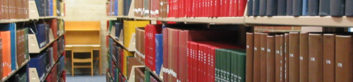
They took what they learned from the website studies and applied that to a study of the catalog use. They wanted to know if users could find an ebook in the catalog (distinguishing it from a print book), understand the catalog displays (and use faceting), and understand the consortia catalog interface.
Lessons learned:
There’s a gap between freshman and senior instruction. They need to develop more instruction sessions on specific topics like ebooks and facets.
Discovery is more than the journey from search box to full text, and there are many factors that impact the end result. This includes the look of a database/catalog, names and labels for resources, placement of the search box, etc.
Core lessons:
1. names and language
Would students know how to define a database, periodical, e-resource, or even research? Using action-based language is more effective. Cutting down on vendor branding helps, too.
2. order matters
First impressions are important, so arrange the order of things by importance/relevance. Minimize reading. Descriptions or lengthy cues are often ignored.
3. be familiar
If you do a search in Google, Amazon, or WorldCat, you get very similar looking search results pages. If you put important content on the right column of your search results page, it won’t be as visible because users are used to ignoring advertising on that part of the screen.
4. let the users help you
Surveys, focus groups, observation studies… and get more than just the vocal minority. Observational studies are more about what they actually do than what they say they do, and are much more valuable in that way. Capture data about errors by making it easy for users to contact you (i.e. EZproxy host errors).
5. search boxes
No box can search everything, but people will use it for anything. If the search box is limited, make that clear. Searches of database titles (not content) can be problematic, as users expect it to search for article-level content.
6. work together
Discovery doesn’t respect department divisions. Work together from the beginning.
Don’t think that doing this once is enough. Keep it ongoing, and remember that the discovery process has many steps.
tl;dr — Usability studies and improving the user experience is hard, but necessary. Discovery isn’t just about buying some massive central index of content.
Discovery on a budget: Improved searching without a Web-scale discovery product
View more presentations from NASIG
NASIG 2012: Why the Internet is More Attractive Than the Library
Speaker: Dr. Lynn Silipigni Connaway, OCLC
Students, particularly undergraduates, find Google search results to make more sense than library database search results. In the past, these kinds of users had to work around our services, but now we need to make our resources fit their workflow.
Connaway has tried to compare 12 different user behavior studies in the UK and the US to draw some broad conclusions, and this has informed her talk today.
Convenience is number one, and it changes. Context and situation are very important, and we need to remember that when asking questions about our users. Sometimes they just want the answer, not instruction on how to do the research.
Most people power browse these days: scan small chunks of information, view first few pages, no real reading. They combine this with squirreling — short, basic searches and saving the content for later use.
Students prefer keyword searches. This is supported by looking at the kinds of terms used in the search. Experts use broad terms to cover all possible indexing, novices use specific terms. So why do we keep trying to get them to use the “advance” search in our resources?
Students are confident with information discovery tools. They mainly use their common sense for determining the credibility of a site. If a site appears to have put some time into the presentation, then they are more likely to believe it.
Students are frustrated with navigating library websites, the inconvenience of communicating with librarians face to face, and they tend to associate libraries only with books, not with other information. They don’t recognize that the library is who is providing them with access to online content like JSTOR and the things they find in Google Scholar.
Students and faculty often don’t realize they can ask a question of a librarian in person because we look “busy” staring at our screens at the desk.
Researchers don’t understand copyright, or what they have signed away. They tend to be self-taught in discovery, picking up the same patterns as their graduate professors. Sometimes they rely on the students to tell them about newer ways of finding information.
Researchers get frustrated with the lack of access to electronic backfiles of journals, discovering non-English content, and unavailable content in search results (dead links, access limitation). Humanities researchers feel like there is a lack of good, specialized search engines for them (mostly for science). They get frustrated when they go to the library because of poor usability (i.e. signs) and a lack of integration between resources.
Access is more important than discovery. They want a seamless transition from discovery to access, without a bunch of authentication barriers.
We should be improving our OPACs. Take a look at Trove and Westerville Public Library. We need to think more like startups.
tl;dr – everything you’ve heard or read about what our users really do and really need, but we still haven’t addressed in the tools and services we offer to them
ER&L 2012 – Between Physical and Digital: Understanding Cross-Channel User Experiences

speaker: Andrea Resmini
He starts with a brief description of the movie The Name of the Rose, which is a bit of a medieval murder mystery involving a monastery library. The “library” is actually a labyrinth, but only in the movie. (The book is a little different.)
The letters on the arches represent the names of the places in the world, and are placed in the library where they would be in the world as it relates to Europe. They didn’t exactly replicate the world, but they ordered it like good librarians.
If you don’t understand the organizational system, it’s just a labyrinth. The movie had to change this because it wouldn’t work to have room after room of books covering the walls. We have to see the labyrinth to be able to participate in the experience, which can be different depending on the medium (book or movie).
Before computers, we relied on experts (people), books, and mentors to learn. With computers, we have access to all of them, at any time. We are constantly connected (if we choose) to streams of data, and the access points are more and more portable.
“Cyberspace is not a place you go to but rather a layer tightly integrated into the world around us.” –Institute for the Future
This is not the future. It’s here now. Facebook, Twitter, Foursquare… our phones and mobile devices connect us.
Think about how you might send a message? Email, text, handwritten, smoke signals, ouija… ti’s the same task, but with many different mediums.
What if someone is looking for a book? They could go to the circ desk, but that’s becoming less common. They could go to a virtual bookshelf for the library. Or they could go to a competitor like Amazon. They could do this on a mobile phone. Or they could just start looking on the shelves themselves, whether they understand the classification/organization or not. The only thing that matters is the book. They don’t want to fight with mobile interfaces, search results in the millions, or creepy library stacks. They just want the book, when they want it, and how they want it.
The library is a channel, as is the labeling, circ desk, website, mobile interface, etc. Unfortunately, they don’t work together. We have silos of channels, not just silos of information.
Think about a bank. You can talk to the call center employee — they can’t help you if it’s not a part of their scripted routines. You can’t start an online process and finish it in a physical space (i.e. online banking then local branch).
Entertainment now uses many channels to reach consumers. If you really want to understand the second and third Matrix movies, you have to be familiar with the accessory channels of information (comic books, video games, etc.). In cross-channel experiences, users constantly move between channels, and will not stay in any single one of them from start to finish.
More companies, like clothing stores, are breaking down the barriers to flow between their physical and virtual stores. You can shop on line and return items to the physical store, for example.
Manifesto:
- Information architectures are becoming open ecologies: no artifacts stand alone — they are all apart of the user experience
- users are becoming intermediaries: participants in these ecosystems actively produce and re-mediate content and meaning
- static becomes dynamic: ecologies are perpetually unfinished, always changing, always open to further refinement and manipulation
- dynamic becomes hybrid: the boundaries separating media, channels, and genres get thinner
- horizontal prevails over vertical: intermediaries push for spontaneity, ephemeral structures of meaning and constant change
- products are becoming experiences: focus shifts from how to design single items to how to design experiences spanning multiple steps
- experiences become cross-channel experiences: experiences bridge multiple connected media, devices and environments into ubiquitous ecologies